
A designer replaces the native <select> with a branded custom component. The date input becomes a bespoke calendar. The search field becomes an autocomplete with rich results. The pull request looks great on a Retina display. It ships.
Two weeks later, a keyboard user files a bug: they cannot reach the date field. A screen-reader user says the suggestions list announces nothing. A user with a motor impairment cannot close the popup without a mouse. The component is visually complete and functionally broken.
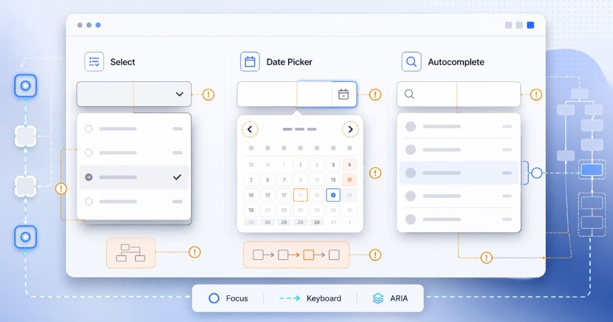
Custom selects, date pickers, and autocomplete fields are the three most consistently under-engineered form controls on the modern web. They all share the same failure mode: native behavior was replaced before the equivalent custom behavior was rebuilt. This guide is a practical engineering playbook for doing it right.
TL;DR
- Custom selects, date pickers, and autocomplete fields fail when keyboard behavior, focus management, and announcements are incomplete.
- Custom selects and autocompletes are not the same widget. Listbox, combobox, and menu are distinct ARIA patterns with different keyboard models.
- Date pickers should not force mouse-only calendar interaction. Manual typing is almost always the faster, more accessible primary path.
- Keeping focus in the right place and exposing the active option/state matters more than sprinkling ARIA on wrapper divs.
- Native controls are often the safest baseline when they meet the product need. Build custom only when you have to — and commit to the engineering cost.
Audit the component structure first, then test the flow with nothing but a keyboard before calling anything production-ready. A quick technical-hygiene pass with the CodeAva Website Audit catches obvious structural problems (missing labels, weak metadata, missing landmarks), but it does not replace manual keyboard and assistive-tech testing for custom form controls — nothing does.
Native first: what developers lose when they replace native controls
Every browser ships with an accumulated decade of keyboard, focus, platform-UI, and assistive-tech work baked into the native form elements. When you replace <select>, <input type="date">, or <input list> with a custom widget, you inherit responsibility for rebuilding all of it.
What native <select> gives you for free:
- Tab-stop behavior consistent with the rest of the form.
- Type-ahead on the first letter of options, arrow-key navigation through the list, Enter/Space to open, Escape to close.
- Mobile platform-native pickers (iOS wheel, Android dialog) that most custom widgets cannot match.
- Correct screen-reader semantics: role, state, label, value, and expanded/collapsed exposure.
- Automatic updates as browsers improve accessibility over time.
Native is not universally perfect — styling is constrained, and complex use cases (rich options, async search, multi-select with tags) often genuinely need a custom widget. But if the product requirement is “pick one value from a short list” and the only reason to go custom is visual uniformity, native almost always wins.
Custom selects are not all the same widget
The team’s design system calls everything a “dropdown”. The ARIA spec does not. Teams routinely conflate four distinct widgets with distinct keyboard models and distinct semantic roles:
- Native-style single select (listbox pattern). A button-like control opens a read-only list of options. Use the
comboboxpattern (button +listboxpopup) or a standalonelistboxdepending on the design. - Editable combobox (autocomplete). A text input that filters a popup of suggestions as the user types. Uses the
comboboxpattern, with DOM focus staying in the input andaria-activedescendanttracking the active option. - Menu button.A button that opens a list of actions or commands (“Save”, “Delete”, “Duplicate”). Uses
role="menu"and menu-item semantics. Not for form values. - Standalone listbox. A persistently visible list where the user selects one or more options without a popup. Uses
role="listbox"withoptionchildren.
role="menu" is not for form fields
role="menu" and role="menuitem"on a value selector confuses assistive technologies and contradicts the widget’s actual behavior.For the menu-button and menu-item patterns specifically (and their distinct keyboard model), the companion guide How to Build Accessible Tabs, Accordions, and Menus covers the full ARIA choreography.
The silent failure of custom selects and comboboxes
The WAI-ARIA combobox pattern is the one most custom “dropdowns” should actually implement — even when the input is read-only. The control is an element (input or button) that owns a popup. Here is a minimal editable combobox with an autocomplete listbox popup:
<label id="country-label" for="country-input">Country</label>

<!-- The combobox is the INPUT, not a wrapper div. -->
<input
  id="country-input"
  type="text"
  role="combobox"
  aria-expanded="false"
  aria-controls="country-listbox"
  aria-autocomplete="list"
  aria-activedescendant=""
  autocomplete="off"
/>

<!-- The popup listbox is a sibling, referenced by aria-controls. -->
<ul
  id="country-listbox"
  role="listbox"
  aria-labelledby="country-label"
  hidden
>
  <li id="country-opt-za" role="option">South Africa</li>
  <li id="country-opt-uk" role="option">United Kingdom</li>
  <li id="country-opt-us" role="option">United States</li>
</ul>

<!-- Status region for assistive-tech result announcements. -->
<div id="country-status" role="status" aria-live="polite" class="sr-only"></div>
The critical relationships:
role="combobox"goes on the actual controlling element (the input or, for select-only variants, a button). Not on a wrapper div.aria-expandedreflects whether the popup is open. It must update on every open/close.aria-controlspoints at the popup’sid.aria-autocompleteis set when the popup filters based on typed text (listfor most autocompletes,inlinewhen text is inserted inline,bothwhen both behaviors apply).aria-activedescendantreferences theidof the currently active option in the open listbox — letting DOM focus stay in the input so the user can keep typing.- Each option has
role="option"and a unique, stableid. The option chosen byaria-activedescendantalso has a visible active style (not just an ARIA attribute).
The two common architectural mistakes to avoid:
- Putting
role="combobox"on a wrapper div while the input below it has no accessible combobox semantics at all. The role must be on the element that receives focus and controls the popup. - Moving DOM focus into the listbox on open for an editable combobox. That breaks typing. Keep focus in the input and use
aria-activedescendantto track the active option.
Select-only variants (non-editable custom selects using a button + listbox popup) can legitimately move focus into the listbox on open, because the user is not typing. The rule is: pick a pattern and implement it consistently. Mixing the two halfway is where most custom selects go wrong.
Date pickers: the keyboard trap
Date pickers ship broken more often than any other custom control on this list. The single most common mistake is disabling the text input to force users into a calendar-only interaction. For most users — and especially for keyboard users, screen-reader users, and users with motor impairments — typing a date is faster and more reliable than navigating a 42-cell grid with arrow keys.
Rule one: let users type
Keep manual entry enabled. Parse and validate typed input against your expected format. Display helper text that shows the format (e.g. YYYY-MM-DD). Show a calendar icon that opensthe popup as a complementary affordance — not as the only path to a value.
Rule two: the calendar popup is not free
Implementations vary. Some date pickers use a lightweight listbox-style popup attached to the input. Some use a modal role="dialog"with a grid inside. Either can be accessible when implemented consistently with a recognised ARIA pattern — what matters is that the popup has:
- Predictable opening and closing behavior, triggered from the keyboard (for example, a calendar-icon button reachable by Tab, or a defined keystroke on the input).
- Clear focus movement: on open, focus goes to a well-defined element inside the popup (usually the currently selected or focused date in the grid). On close, focus returns to the input.
- Escape closes the popup and returns focus to the input without applying a partial selection.
- A month/year navigation model that is reachable and operable by keyboard, with accessible labels on the previous/next buttons.
- A date grid (
role="grid"withrole="gridcell"children, or an ARIA-authoring-practices-compliant variant) where every interactive cell has an accessible name including its full date.
If the popup is implemented as a modal dialog, it must also follow the focus-trap and dismissal rules described in Accessible Modal Dialogs in React. A non-modal popup has more flexibility but still needs the focus-return and Escape behavior to be explicit.
Calendar-grid keystroke expectations
| Key | Expected behavior in the calendar grid |
|---|---|
| Arrow keys | Move the focused date one day (left/right) or one week (up/down). Crossing a month boundary moves into the adjacent month. |
Enter / Space | Select the focused date, update the input value, close the popup, and return focus to the input. |
Home / End | Move focus to the first / last day of the current week. |
PageUp / PageDown | Move focus back / forward one month. |
Shift + PageUp / Shift + PageDown | Move focus back / forward one year. |
Esc | Close the popup without changing the input value and return focus to the input. |
Not every date picker needs every row of that table, but skipping most of them is how date pickers become keyboard traps. Pick a pattern, document the keystroke contract, and implement it consistently.
Autocomplete: visual suggestions are not enough
An autocomplete is a combobox where the listbox filters as the user types. The structural ARIA is the same as the earlier example. What additionally goes wrong:
The active option is not exposed
Visually highlighting the “active” suggestion in the popup is not enough. The combobox must point aria-activedescendantat that option’s id on every keyboard move, and it must clear the value when the popup closes or the active option is deselected. A stale aria-activedescendant that points at an element that no longer exists is worse than none at all.
Result availability is silent
When the user types and the list of suggestions changes entirely, a screen reader may not announce anything at all. The combobox’s aria-expanded changes are not enough in practice. A common, robust solution is a polite live region that announces the number of results:
<!-- Visually-hidden polite live region -->
<div
  id="search-status"
  role="status"
  aria-live="polite"
  aria-atomic="true"
  class="sr-only"
></div>

<script>
  // When the results list updates (debounced):
  function announceResults(count) {
    const msg = count === 0
      ? "No results."
      : count === 1
        ? "1 result available. Use arrow keys to review."
        : `${count} results available. Use arrow keys to review.`;
    document.getElementById("search-status").textContent = msg;
  }
</script>
A live region is not the only acceptable implementation, but it is the most reliable when results update dynamically in response to typing. Keep the message short, debounce the update so fast typing does not queue announcements, and clear stale messages when the popup closes. The broader patterns for live regions — and when polite beats assertive — are covered in Form Validation Accessibility: ARIA and Live Regions.
Typing and navigation fight each other
When arrow keys both move the cursor in the input and change the active suggestion, users cannot tell which action they triggered. In an editable combobox, arrow keys typically control the active suggestion in the popup while typing and the cursor position are driven by character keys and Home/End. Document the contract, implement it consistently, and match user expectations from platform-native autocompletes.
Selection and dismissal are ambiguous
Make the selection model explicit: Enter commits the active suggestion, Escape closes the popup without changing the value, and clicking outside dismisses the popup. If the component supports “commit on blur”, document exactly when it applies — and never apply it when the user escaped away from the popup intentionally.
The biggest accessibility mistakes teams make
- Wrapper divs with click handlers standing in for semantic controls. Non-button
<div>elements do not receive keyboard focus, do not fire on Enter/Space, and do not announce as interactive. role="combobox"on the wrong element, usually a wrapper div rather than the input or button that actually controls the popup.- Moving DOM focus into the listboxin an editable combobox — which breaks typing. Use
aria-activedescendantinstead. - Failing to expose the active suggestion via
aria-activedescendant, leaving screen readers with no way to announce which option the user has landed on. - Forcing calendar-only date selection by disabling the text input.
- Opening a date-picker popup without moving focus logically — focus stays on the trigger, or worse, on
<body>, so keyboard users have no path into the grid. - Letting focus escape or disappear inside popup UI, especially when the popup is a modal dialog without a proper focus trap.
- Hiding or removing the focus ring. If users cannot see where focus is, they cannot use the component by keyboard — full stop.
- Shipping a component that works only with pointer input because no one tested it without a mouse.
Native vs custom: the decision framework
Before writing a line of custom widget code, run through these questions honestly as a team:
- Do we truly need a custom UI?If the product requirement is “pick one of these options”, native
<select>is a defensible answer. - Can native
<select>,<input type="date">, or<input list>satisfy the requirement on the platforms we support? On mobile, native date inputs in particular offer a platform-native UX that most custom widgets cannot match. - Is the custom control adding real product value, or just visual uniformity? A custom widget for async search, multi-select tagging, rich option rendering, or domain-specific validation is defensible. A custom widget to change the border color usually is not.
- Can we maintain keyboard, focus, announcement, and state logic across browsers and assistive tech for the lifetime of the component? That is the real question. Custom widgets are a long-term engineering commitment, not a one-sprint design task.
The answer is often a hybrid: native where it works well, carefully engineered custom widgets (often built on or heavily inspired by standards-aligned headless component libraries) where the product genuinely requires them. Either way, the accessibility work is deliberate, tested, and owned by the team.
| Requirement | Native usually fits | Custom is often warranted |
|---|---|---|
| Short list, single value | <select> | When options need icons, descriptions, or grouped rendering that <optgroup> cannot express. |
| Date input | <input type="date"> with a visible format hint | Date ranges, availability grids, or strict business calendars native cannot express. |
| Autocomplete | <input list> + <datalist> for small, static sets | Async search, fuzzy matching, rich option rendering, multi-select with tags. |
| Multi-select | <select multiple> for simple cases | Tag-style multi-select with removable chips and typeahead filtering. |
The manual QA workflow
Automated accessibility tests catch roughly a third of real issues, and nearly none of the ones unique to custom form controls. The rest is manual. Work through this checklist for every new custom control and on every meaningful refactor:
- Test with keyboard only. Put the mouse away. Reach the control with Tab from a realistic starting point.
- Confirm every control receives focus logically. No hidden focusable elements, no skipped fields, no tab stops you did not intend.
- Confirm focus remains visible at every step. No removed outlines, no low-contrast indicators.
- Confirm the popup opens and closes predictably. Test the documented open/close keys and Escape.
- Confirm arrow keys, Enter, Space, and Escape behave as the pattern specifies. Match them against the keystroke contract below, not against a hunch.
- Confirm manual entry works where it should — especially in date pickers and autocompletes.
- Confirm the active option or focused date is exposed accessibly. Screen-reader announcement, not just a highlight.
- Confirm focus returns logicallyafter the popup closes — to the input, the trigger, or wherever the pattern dictates.
- Test on real user flows, not isolated component demos. A combobox inside a modal inside a form is a very different operability problem than a Storybook preview.
For the broader keyboard-operability checks that apply beyond individual components, see Keyboard Navigation Testing Checklist for Web Apps.
Common keystroke expectations by component
One reference table for the three widget families. Match your implementation against the row it actually belongs to — do not mix rows in the same component.
| Component | Expected key behavior | Most common failure |
|---|---|---|
| Select-only custom select (button + listbox popup) | Tab focuses the button; Enter/Space/Down opens the listbox; focus moves to the selected or first option; arrows move focus through options; Enter commits; Escape closes and returns focus to the button. | Focus stays on the button after opening; arrow keys do not move through options; no Escape handling. |
| Editable autocomplete / combobox | Tab focuses the input; typing filters; Down opens the popup and moves the active option via aria-activedescendant; Enter commits the active option; Escape closes without committing. | DOM focus moves into the list and breaks typing; active option not exposed to assistive tech; no status announcement when results change. |
| Date picker input + popup trigger | Tab focuses the input; typing enters a date directly; a reachable calendar-icon button opens the popup; Escape closes without applying; focus returns to the input on close. | Typing disabled; calendar-only interaction; focus lost on open or close; no Escape path. |
| Calendar dialog / grid | Arrow keys move one day / one week; PageUp/PageDown one month; Shift+PageUp/PageDown one year; Home/End start/end of week; Enter/Space selects and closes; Escape closes without selecting. | Arrow keys move only inside a single week; no month/year navigation; unlabelled grid cells; no focus on the current date when the popup opens. |
Performance and UX tradeoffs of heavy custom controls
Accessibility and performance usually fail together. Heavy custom form components drag in extra JavaScript, extra state, extra event handlers, and extra re-renders — all of which hurt interaction responsivenessand make the keyboard and focus logic harder to keep correct.
Symptoms to watch for:
- A date picker that downloads 40 KB of locale data before the user has typed a digit.
- An autocomplete that re-renders the entire popup on every keystroke, producing visible input lag on mid-range devices.
- A “select” that re-measures its popup position on every scroll, causing layout jank on long pages.
- A component library that ships the same widget in three bundles because different teams imported it differently.
Native controls sidestep all of this. When custom widgets are justified, keep them standards-aligned, lean, and measurable. The LCP Debugging Checklist for Modern Frontends covers the load-side of the performance story; interaction-side regressions are often caused by the same heavy stateful components that also break accessibility.
Structure is not enough, but it is the first check
A fast technical-structure pass catches obvious accessibility-adjacent issues on a page — missing<title>, empty metadata, missing landmarks, wrong heading levels, bad redirects that break navigation — before you invest in the manual operability review that custom form controls actually require.
The CodeAva Website Audit checks a single URL for HTTP status, on-page metadata, Open Graph and Twitter Card tags, crawl signals, and common security headers. It does not confirm full keyboard operability, it does not verify aria-activedescendantcorrectness, and it does not test date-picker dialog behavior — nothing automated reliably does. Use it to clear the structural-hygiene floor, then test the actual components manually with a keyboard and a screen reader. For the automated-vs-manual split in broader accessibility testing, see A Practical Guide to Automated Accessibility Testing.
ARIA does not make a component accessible
Accessibility is a component-architecture decision
The three widgets this article covers — custom selects, date pickers, and autocomplete fields — are the ones where the gap between “looks like it works” and “actually works” is widest. They reward teams that commit to the engineering cost, and they punish teams that treat accessibility as a last-minute ARIA patch on top of a <div>.
Native-first is the safest baseline. When custom widgets are genuinely warranted, the keyboard model, focus management, and assistive-tech announcements must be deliberate, documented, and tested. Accessibility quality is not a compliance checkbox; it is a property of how the component is architected from the first commit.
When you are ready to pressure-test a specific page, start with a CodeAva Website Audit for structural hygiene, then work through the manual keyboard and screen-reader pass this article describes. For the patterns that share the most keyboard choreography with the widgets above, see How to Build Accessible Tabs, Accordions, and Menus, and for modal-pattern date-picker popups specifically, Accessible Modal Dialogs in React covers the focus-management rules that apply.