A site can have efficient JavaScript, lean CSS, and a clean rendering architecture — and still fail Largest Contentful Paint because of a single oversized hero image served in the wrong format. Image format decisions are often treated as a design detail or a one-time upload workflow, when in practice they are one of the highest-impact and most recoverable performance choices on any page.
Frontend teams frequently ship large PNGs as hero backgrounds, unoptimized JPEGs from a content team's camera roll, or retina-sized assets with no responsive delivery strategy. Lighthouse flags these as "serve images in next-gen formats" or "properly size images." Fixing them does not require a significant engineering effort — it requires understanding which format to use, why, and how to serve it with a fallback that keeps older environments working.
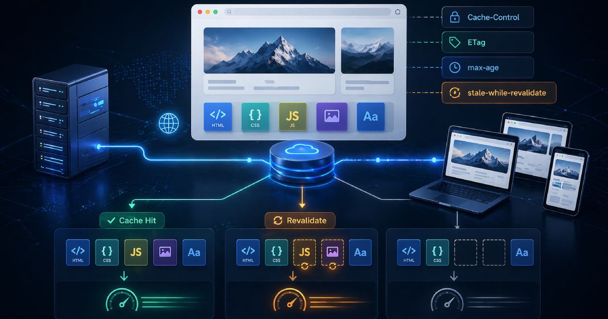
TL;DR
- AVIF is a modern high-efficiency format that often achieves the smallest file sizes for photographic imagery. Use it with a fallback.
- WebP is the practical modern default — broadly supported, good compression, supports transparency, and a safe upgrade path from JPEG and PNG.
- PNG remains the right choice for lossless output, crisp screenshots, and specific transparency needs.
- JPEG still matters for legacy compatibility and as the fallback in multi-format delivery strategies.
- The standard production pattern is: AVIF first, WebP second, JPEG/PNG fallback.
If you have a large image that needs optimizing right now, use the CodeAva Image Optimizer to compress, resize, and convert images to WebP or AVIF locally in your browser — no uploads, no server.
Why image bytes matter more than teams think
Image bytes are not abstract. They translate directly into load time, bandwidth consumption, and user experience. A hero image that weighs 2.5 MB on a fast fiber connection might feel acceptable in a local browser test. On a mid-range mobile device on a variable network connection, that same image can delay the visible render of the page by several seconds.
Images frequently dominate the critical rendering path for landing pages, product pages, and editorial content. When the Largest Contentful Paint element is an image — and it often is — the time it takes for that image to load and paint is your LCP score. That score is one of Google's Core Web Vitals and contributes to search ranking signals.
Reducing image weight is often the cleanest and most reliable way to improve perceived performance. Format conversion and compression do not require JavaScript changes, framework upgrades, or infrastructure work. They require choosing the right codec, encoding at a sensible quality level, sizing the image for the layout, and serving it with an appropriate delivery strategy. The returns can be significant and immediate.
The format breakdown
AVIF — high-efficiency modern delivery
AVIF (AV1 Image File Format) is based on the AV1 video codec and represents the current state of the art in lossy web image compression. It typically delivers smaller files than WebP at comparable visual quality, particularly for photographic content and gradients. It supports transparency, HDR colour spaces, and both lossy and lossless encoding modes.
The practical consideration for teams is that AVIF encoding support varies across browser versions, operating systems, image processing pipelines, and CDN tooling. Modern desktop and mobile browsers have broad AVIF support, but not every environment handles it equally. The correct production approach is to serve AVIF to browsers that support it and provide a WebP or JPEG fallback for others — the HTML <picture> element makes this straightforward.
For performance-sensitive pages where LCP is a concern, AVIF is worth using wherever your workflow and toolchain support it. The file-size advantage over JPEG can be substantial for the kinds of hero imagery that commonly drive LCP failures.
WebP — the dependable modern workhorse
WebP was developed by Google and is now supported across all modern browsers. It supports both lossy and lossless compression, transparency via an alpha channel, and animation. For most teams modernizing their image delivery, WebP is the safest and most practical starting point.
Converting existing JPEG and PNG assets to WebP is a reliable way to reduce file size without taking on the fallback complexity of a newer codec like AVIF. A lossy WebP at a quality setting around 80–85 will typically be meaningfully smaller than the equivalent JPEG while remaining visually indistinguishable to most users. For assets that currently ship as PNG, a lossy WebP conversion is often the single biggest file-size win available.
WebP is the pragmatic choice when you want modern compression with minimal fallback risk. It is particularly well-suited for teams that cannot yet build a full multi-format delivery pipeline but want to move away from JPEG and PNG immediately.
PNG — lossless precision where it genuinely matters
PNG (Portable Network Graphics) is a lossless format — every pixel in the output is identical to the source. This makes it the right choice for screenshots with crisp text, UI diagrams, logos with fine detail, and any imagery where exact colour fidelity or artifact-free rendering is required.
Where teams often go wrong is reaching for PNG by default because it "looks better" or because it was the export format from a design tool. A full-page screenshot or product hero image saved as PNG can easily weigh several megabytes. The same image encoded as a lossy WebP at quality 82 will typically look visually equivalent at a fraction of the size.
PNG is the right answer when lossless output genuinely matters. For photographic or complex photorealistic content, it is usually not the right answer for the web.
What about SVG?
JPEG — still relevant as a fallback and in legacy contexts
JPEG has been the dominant web photo format for decades and remains widely used. It delivers good compression for photographic imagery using a lossy algorithm that is well-understood and broadly supported in every image processing environment.
JPEG does not support transparency. It introduces block-based compression artefacts at lower quality settings, particularly near hard edges and text. It has no alpha channel and no animation support. For new web production work where you have full control over format choice, WebP or AVIF will generally deliver better results.
JPEG's ongoing value is as the fallback in a multi-format delivery strategy, and in contexts where older tooling, CMS systems, or downstream image processing pipelines do not yet handle WebP or AVIF reliably. It is not obsolete — it is the safety net that keeps images working everywhere.
The decision matrix
Use this table to match your image type and workflow context to the right format.
| Format | Best used for | Transparency | Compression style | Practical note |
|---|---|---|---|---|
| AVIF | Performance-critical hero images, photographic content, modern delivery pipelines | Yes | Lossy or lossless | Best compression available. Use with a WebP or JPEG fallback via <picture> for broad compatibility. |
| WebP | General web imagery, replacing JPEG and PNG assets, transparent graphics on the web | Yes | Lossy or lossless | Broad modern browser support. Safer default than AVIF for teams without a multi-format pipeline. |
| PNG | Screenshots with text, UI diagrams, logos requiring pixel-perfect fidelity, lossless transparency | Yes | Lossless only | Larger files than WebP or JPEG for photographic content. Reserve for genuinely lossless use cases. |
| JPEG | Legacy compatibility, fallback images in multi-source delivery, environments without modern codec support | No | Lossy | Universal support. No transparency. Still the right fallback for the <img> tag in a <picture> element. |
Quick answer: what format should I use?
Format decision guide
- Use AVIF for: performance-sensitive hero images, LCP-critical assets, and modern delivery workflows where fallback support exists via
<picture>. - Use WebP for: general web imagery, replacing legacy JPEG and PNG files, and any workflow where you want strong compression with broad modern browser support.
- Use PNG for: lossless screenshots, UI graphics with sharp edges and text, and specific transparency requirements where artifact-free quality matters.
- Use JPEG for: legacy compatibility, fallback images in a multi-source
<picture>element, and environments where modern formats are not reliably supported. - Use SVG for: logos, icons, and vector diagrams — do not rasterize vector artwork into PNG when SVG is an option.
The modern implementation pattern: <picture> with fallback
Choosing the right format is half the work. The other half is serving it in a way that handles environments where that format is not supported. The HTML <picture> element exists exactly for this: it lets you declare multiple sources in order of preference, and the browser picks the first one it can handle.
<picture>
  <!-- AVIF: highest compression, modern browsers -->
  <source srcSet="hero.avif" type="image/avif" />
  <!-- WebP: broad modern support, fallback from AVIF -->
  <source srcSet="hero.webp" type="image/webp" />
  <!-- JPEG: universal fallback for all environments -->
  <img
    src="hero.jpg"
    alt="Descriptive alt text for the image"
    width="1200"
    height="630"
    loading="lazy"
  />
</picture>
The order of <source> elements is meaningful. Browsers evaluate sources from top to bottom and use the first type they support. Placing AVIF first ensures modern browsers that support it will receive the smallest file. WebP handles the next tier of support. The <img> fallback at the end handles any environment that does not understand <picture> at all.
Loading strategy for LCP images
loading="lazy" is appropriate for below-the-fold images but should not be applied to the element most likely to be the Largest Contentful Paint. For a hero image that is visible on initial load, use loading="eager" (the default) and consider adding a <link rel='preload'> hint in the <head> to fetch the image earlier in the resource waterfall.
Adding explicit width and height attributes on the <img> tag helps the browser reserve the correct layout space before the image loads, which prevents Cumulative Layout Shift — another Core Web Vital.
Common mistakes teams make with image formats
Uploading a large PNG as a photographic hero image
PNG is lossless by design. A full-resolution product or lifestyle photo saved as PNG will typically be several times larger than the same image encoded as a lossy WebP or AVIF. Using PNG for photographic hero images is one of the most common sources of avoidable LCP failures.
Converting everything to AVIF or WebP without fallback planning
Switching entirely to AVIF without a fallback <picture> strategy risks broken images in environments that do not support the codec. This includes certain older mobile browsers, some email clients, and third-party tools that process or re-host images. Always use the multi-source pattern in production.
Resizing images in CSS only while still serving the full-size file
Applying width: 100% in CSS does not reduce the bytes the browser downloads. If you are displaying a 1920px-wide image in a 400px column, the browser still fetches the full-resolution file. Use appropriately sized source images and the srcset attribute to serve different resolutions for different viewport widths.
Assuming compression alone fixes bad dimensions
Compressing an image that is twice the required size is better than nothing, but it is not the same as serving a correctly sized image. A 3000×2000px hero image converted to WebP is still serving far more pixels than a standard viewport needs. Compression and resizing are complementary, not interchangeable.
Forgetting that image quality affects both UX and SEO
Compressing too aggressively introduces visible artefacts — blocking patterns in JPEG, blurring in WebP at low quality settings. These degrade the user experience and can reflect poorly on a brand's production quality. Use the before/after comparison to verify output quality before shipping. A quality setting around 80–85 is a reasonable starting point for most photographic content.
Privacy-first image optimization in the browser
Many teams work with images they cannot upload to a third-party server. Unreleased product photography, pre-launch campaign assets, client work under NDA, internal brand guidelines — uploading these to a web-based compressor means they leave the device and land on someone else's infrastructure. That is often not an acceptable workflow.
The CodeAva Image Optimizer processes everything locally in the browser using the Canvas API. Your images are never uploaded to a server, never stored, and never transmitted. You can compress, resize, and convert to WebP or AVIF directly in your browser tab, then download the results.
It supports practical workflows including hero images, Open Graph assets at exactly 1200×630, bulk batch compression, and side-by-side before/after quality comparison. AVIF encoding is supported where the browser allows it, with a clear fallback notice if it is not available in the current environment.
How teams actually use image optimization
Hero image for a landing page
A landing page hero is the most common LCP failure point. A typical workflow: export from Figma or a design tool as a high-quality PNG or JPEG, resize to 1920px maximum width, encode to WebP at quality 82, encode an AVIF version for modern browsers, then serve with a <picture> element and a link rel="preload" hint for the expected LCP format.
Open Graph image for social sharing
Open Graph images need to be exactly 1200×630 for most social platforms. A JPEG or WebP at quality 80 is suitable — the additional compression benefit of AVIF matters less here because the image is loaded by social crawlers and preview renderers, not a performance-critical page flow. Use the Open Graph preset in the Image Optimizer to resize in one step.
E-commerce product image sets
Product images are frequently uploaded in large, unoptimized formats from photography workflows. Standardizing to WebP at 800×800 with a quality setting around 82–85 typically cuts file sizes substantially without affecting perceived image quality at display size. For performance-critical product pages, AVIF with a WebP fallback is worth the additional encoding step.
Content marketing images for blog posts
Blog images are often uploaded once and never revisited. A batch compression pass on existing image assets — converting PNGs to WebP or recompressing oversized JPEGs — can meaningfully reduce page weight across an entire content library. The CodeAva Image Optimizer supports multi-file batches with a ZIP download for the full output set.
Internal assets that cannot be uploaded to a third-party SaaS
Design teams and agencies regularly work with pre-release materials. Browser-based local processing removes the question of whether your images are being stored or indexed by a third party. The local processing model is the same capability, with none of the upload risk.
Conclusion and next steps
Image optimization is not an afterthought — it is part of the build process, the deployment checklist, and the ongoing content workflow. The format decision matters: AVIF for maximum compression with fallback support, WebP as the practical modern default, PNG for lossless output where it genuinely applies, JPEG for universal fallback compatibility.
If you are addressing a Core Web Vitals LCP problem, image bytes are one of the first places to look. Format conversion and resizing are often among the highest-return and lowest-risk changes available to a performance engineer.
For the broader INP and responsiveness side of Core Web Vitals — where third-party scripts often create the most hidden damage — see Third-Party Scripts and INP: A Practical Optimization Guide. Performance is a system, and images are one of the most impactful layers in it.
When you are ready to convert and compress: use the CodeAva Image Optimizer — free, local, and private.